Polish-Americans

Polish
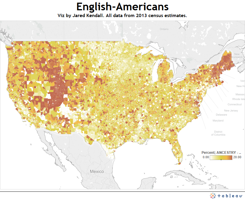
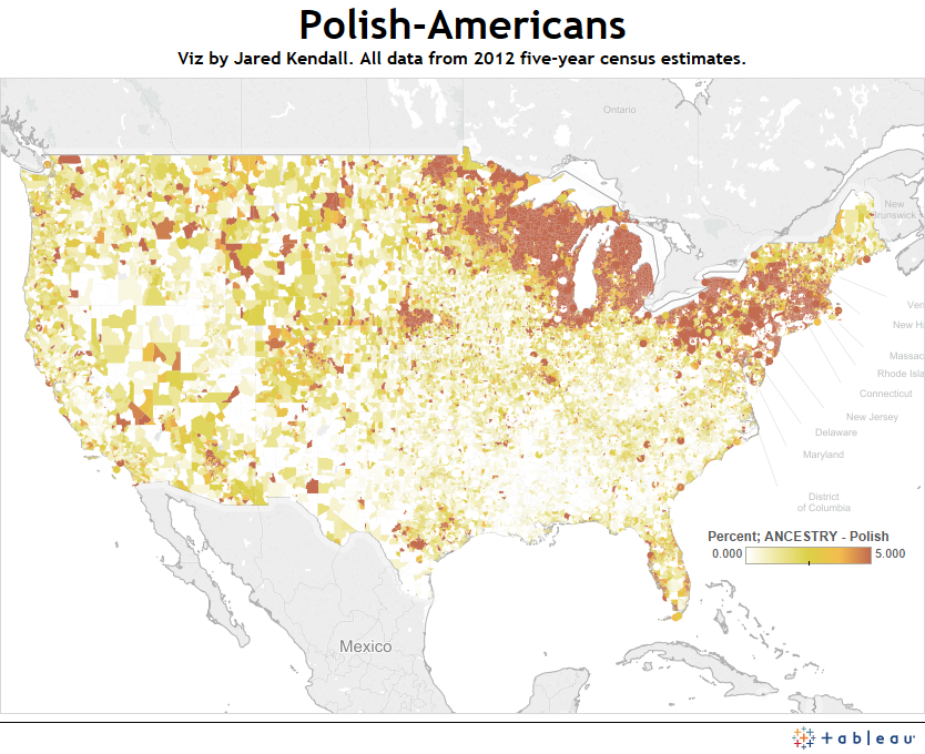
Polish-Americans are highly concentrated among the Great Lakes region of the United States, showing much less diffusion than some of the other ancestries I’ve looked at, like the Irish.

Aside from their fairly specific geographic distribution, the Polish-American population doesn’t hold many surprises. I had thought there’d be more Poles, but one problem with preconceptions about ancestry is that there are so many different ancestries which make up the American landscape that it’s difficult to get a handle on all of them at once, as well as their relative prevalence. When I approach the end of this project, I do hope to put together a single map showing multiple ancestral/ethnic groupings at once — but I’m running into technical difficulties, and it remains a challenging work in progress. Cross your fingers for me!

Here’s a link to my Tableau on Polish-Americans, so you can drill down, zoom in, etc:

https://public.tableausoftware.com/profile/jared5561#!/vizhome/supercensus/Polish


Advertisement

Native Sons – A map of Americans living in the state where they were born.

Born_In_StateHaving seen an interactive the New York Times did recently looking at migration within the United States, http://www.nytimes.com/2014/08/16/upshot/mapping-migration-in-the-united-states-since-1900.html?WT.mc_id=AD-D-E-KEYWEE-SOC-FP-NOV-AUD-DEV-ROS-1101-1204&bicmp=AD&bicmlukp=WT.mc_id&bicmst=1414728000&bicmet=1451538000&ad-keywords=KeyweeCampaign&kwp_0=4807&_r=0&abt=0002&abg=1, I decided that maybe I should go ahead and share my own take on it.

I looked at what I called “Native Sons” almost as soon as I started playing with the zipcode-level census data. The clear state borders you can see really stood out to me. Sadly, I didn’t think anyone else would be as interested in that… But from what I’ve seen of responses to the Times interactive, this is not the case. At least for Louisiana – one of the biggest homebodies of all the states. Born here, stay here, die here, apparently. Either the state is awesome, or we’re kind of timid/boring.

Enjoy!

Link to interactive:https://public.tableausoftware.com/views/supercensus/BornInState?:embed=y&:display_count=no

Irish-Americans

IrishThe first thing that struck me when I made this map: What the heck is up with Chicago?

Seriously, I had always thought Chicago was supposed to have an enormous Irish population – yet you just don’t see it on this zip-code level census data. Even poking around and mousing over individual zip codes in the area, I didn’t see much to explain the lack — no concentrated, 100% Irish neighborhoods, say.

But, again, that’s why you do these sorts of projects. Surprise results are a good thing, as they help dispel illusions you previously labored under. The Irish are a wonderful group to study when discussing immigration, because they’re one of the more famous groups of immigrants to arrive in America and face opposition from those who were already here. The map is set so the darkest green (please forgive the stereotype I indulged in, using green to represent the Irish) represents zip codes with 25% or more Irish descent.

There are many more ancestral groups to cover, and I will keep putting together new maps for as long as I can find the time — keep watching jaredwkendall.com to see more of what makes up those who  make up America.

Link to my Tableau tool, so you can get individual zip code data for all ancestral breakdowns:

https://public.tableausoftware.com/profile/jared5561#!/vizhome/supercensus/Irish

Native Americans in America

Native_AmericansIt being Thanksgiving, I think of Native Americans, among other things. It’s a carryover from my childhood, when the whole Pilgrims & Indians mythos was treated as gospel truth.

Looking at their distribution, you can see Native American concentrations in modern tribal areas — Oklahoma, in particular, is easy to pick out. Other reservations and concentrations of Native Americans can be seen in the southwest, and parts of the northern Great Plains.

Native American demographics weren’t included in the census dataset I used as my primary source. They’re included in files that look at race, rather than ancestry, and it’s a little weird to me that the two aren’t kept together. Race is about more than just race – it’s also about where we came from, and how we got where we are today. These maps help show both where we are now, and to some extent, I think they speak to how we got here, as well.

Link to map in Tableau: https://public.tableausoftware.com/views/supercensus/NativeAmericans?:embed=y&:display_count=no

English in America

EnglishLike many Americans, I’m a little hazy on my family tree. However, I’ve always thought of myself as predominately British, and assumed that as a former British colony, English descendents would be heavily represented when I mapped them.

This was not the case.

While America has plenty of English-Americans, they’re much more sparse than, say, German-Americans. This also brings up an interesting question – how much of these census results is attributed to actual lineage, and how much is due to variances in self-reporting? In other words, when you can count German, English, Welsh and Scottish relatives as part of your family tree, how do you choose to describe yourself? Perhaps claiming English descent seems too pedestrian, and loses out to the more “exciting” choices of, say, Scottish. To get true data, you would probably have to turn to genetic testing, and data from genetic testers that release demographic information can’t be trusted as being statistically representative of everyone – getting tested costs money, and requires an interest in such things. That’s going to skew results.

For now, the census is as good as it gets, and I was quite surprised by this one. Here’s hoping I’m not alone – expected results can be awfully boring.

Link to my Tableau tool:

https://public.tableausoftware.com/views/supercensus/English?:embed=y&:display_count=no

A Very German America

german_americansToday I’m looking at one of the largest demographic groups in America’s ethnic background: The Germans.

German-Americans are extremely prevalent across large portions of the nation. Unlike some of the other maps I’ve done in this series, Germans don’t show up in narrow patches or bands – they fill the map in massive numbers across large swaths of territory.

As you can see from the map, a lot of us list German ancestry. The mid-west, in particular, seems to have held a special attraction for German immigrants.

Here’s a link to my Tableau tool, so you can zoom in, explore, and play:

https://public.tableausoftware.com/profile/jared5561#!/vizhome/supercensus/germanamericans


French-Americans, and Louisiana’s heritage

french_americans


Today I turn my census-driven attention to the French – a population of particular importance in Louisiana.

Louisiana owes much of her culture, her food, and her style to the French blood which runs through the byways and bayous of the state. While it’s no secret that Louisiana has a large number of French-descended residents, seeing the distribution mapped out (and seeing it nationally) is fascinating.

I’ll continue this series, looking at more of the heritage of American immigration.

The dataset I’m working with, the 2013 census estimations, has some glaring oversights, however: It doesn’t include data on native Americans, african-Americans (except for sub-saharan Africans), or Hispanics. I’ll need to get data for those groups elsewhere, so that I can include them in the project. For whatever reason, this particular dataset seems to have a strong focus on European immigration. Still, given that many of the folks voicing strong opinions during the current immigration debate are of European descent, perhaps this oversight isn’t a lethal one. Aside from native Americans, we all came from somewhere else. These maps and this data helps to show precisely where we came from, and where we ended up.

Here’s a link to the Tableau tool so you can see things in greater detail, as well as zoom in, get county info, etc:

https://public.tableausoftware.com/profile/jared5561#!/vizhome/supercensus/frenchamericans

Enjoy and share! 😀

Danish-Americans

Danish_Americans

Continuing my look at American immigration, today I’ve put together a map showing the distribution of zip codes with concentrations of residents of Danish descent. I’ve also made changes to the Tableau tool so that you can now mouse over zip codes and get information on the nearest city, the county, and the state where that zip code is located (the graphic overlay makes it impossible to read state borders and such in Tableau).

Calling America a melting pot is a cliche – but looking at the ingredients is fascinating. I’m currently working on getting racial data pulled in, because the ancestry data in these tables is curiously lacking of such obvious and necessary things as native Americans, Mexican-Americans and African-Americans. The census can be maddening to work with.

Here’s a link to the Tableau, so you can zoom in, get county info, etc:

https://public.tableausoftware.com/profile/jared5561#!/vizhome/supercensus/DanishAmericans

A map of Czech-Americans

In my continuing series looking at demographics of America, I now turn to Czech-Americans. Using Census data, I’ve mapped where people reporting Czech ancestry live in the United States.

Czech

The map shows a strong distribution in the mid-west and Texas, and is set so that it tops out at 5% of the population reporting Czech ancestry. I’ll be continuing this series – so stay tuned for new maps and a new look at the polyglot nature of America!

Here’s the Tableau map, if you’d like to zoom in and see smaller geographic areas:

https://public.tableausoftware.com/profile/jared5561#!/vizhome/supercensus/Czech

Where do our veterans live?

veteran_status

Lately, I’ve been spending a lot of time with census data. This map is one of the results of that effort – and it shows, by zip code, where veterans are concentrated among the local population. Wherever on the map you see dark red, 20% (or more) of the residents are veterans.

Apparently, the west holds a draw for our veterans. Frankly, I’m a bit surprised by how much of the country includes veteran populations of 20% or more.

Here’s a link to the viz – you can mouse over zip codes for individual percentages, zoom in, etc:

https://public.tableausoftware.com/views/supercensus/veteranstatus?:embed=y&:display_count=no