Binders full of women… and Tableau.

Romney and TweetsBinders full of Tableau

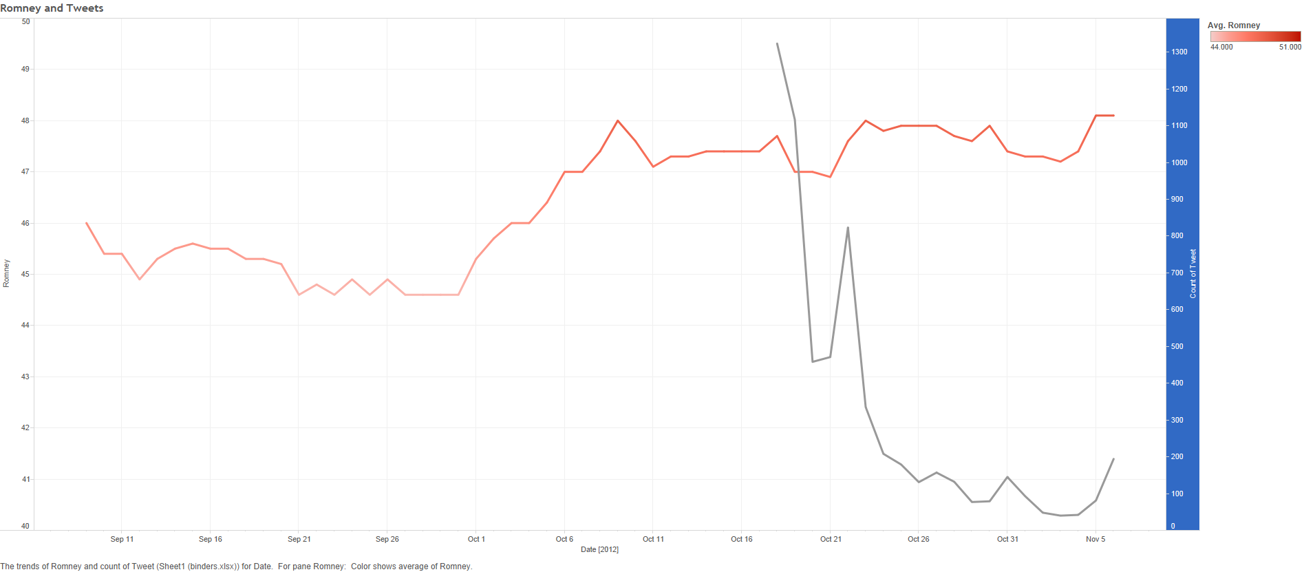
A quick Tableau looking at tweets with the #bindersfullofwomen hashtag following Romney’s debate gaffe turning into a viral meme.

I made this as part of a Storify piece on the binders uproar, you can see it here: http://storify.com/jwkendall/binders-full-of-women

I was pleasantly surprised by how easily I was able to put the poll and twitter data together was also quite proud of the fact that I got the twitter information myself – I didn’t use any third-party service. I actually simply held down the “page down” key on my keyboard for a solid half-hour from the main Twitter page. Perhaps forty five minutes. I retrieved around 10,000 tweets, and it didn’t appear my browser would’ve put up with my retrieving many more than that. This means the data can’t penetrate to that initial surge on the 16th or 17th, but frankly, the interesting data comes later, when we see the life cycle play out.

Using Tableau With Porn

Image

Data is beautiful, in that it doesn’t care about its surroundings. Data can be gathered by cloistered nuns, and it can be gathered by pornographers. Massive online porn destination, Pornhub, recently demonstrated this when it released an interactive showing the top three porn search terms, as well as the average length of stay, broken down by each state.

I will include a link to Pornhub’s viz, but first I’d like to put up a link to the “corrected” version I made. I found the original difficult to navigate when you wanted to see a particular state’s results. I fixed this by making the map a control feature. Now, when you click on a state, you only see that state’s information elsewhere on the page. Here’s the link:


http://public.tableausoftware.com/views/PH_avg-visit-durationredshtick/Dashboard1?:embed=y&:display_count=no


It defaults to Louisiana. Simply click on our state to see everyone, or click on another state if you’d just like to jump to their results.

I don’t anticipate working with pornography data again anytime soon. That being said, I would definitely like to get my hands on some of the raw figures involved. I’d just be sure and wash my hands really well after.

Here’s Pornhub’s original visualization, without my snazzy map cotrol:


http://public.tableausoftware.com/shared/HR9SZ66TW?:display_count=yes


And at the moment, they have it saved with a state selected. Not sure what’s up with that. But I applaud their use of the technology. I would love to see more corporations follow their lead. Internal data holds amazing stories – share them with the world!

What LSU spends on salaries

Tableau viz shows how much, total, was spent on salaries in each salary range.

Tableau viz shows how much, total, was spent on salaries in each salary range.

I love this one. It shows how much money, total, is spent to pay the salaries of LSU employees with salaries in a given range.

I’ll also include the link to the Tableau viz. It lets you play with switching between nine month and annual salaried employees. Nine month employees tend to be faculty, year round tend to be staff, but that’s only a very general rule of thumb.

http://public.tableausoftware.com/views/manualmap2test/SecondSalaryDistributionSheet?:embed=y&:display_count=no

As always, it’s the side stories I find fascinating with these projects.

Missing LSU Employee Addresses

Image

I love when a data project yields side information. In this case, while searching the LSU directory for employee contact information, I found that lower-salary employees were *much* more likely to be missing from the LSU online directory. Numbers are fun.

http://public.tableausoftware.com/views/manualmap2test/MissingAddressSimpleDash?:embed=y&:display_count=no

Reveille Ranks

Today I’m experimenting with seeing whether I could use Tableau for a fairly non-Tableau task: Presenting a searchable, sortable list of reviews built from the entertainment reviews at the Reveille. Initially, I didn’t think it could be done at all. However, after some experimentation, I am starting to wonder whether it might, in fact, be possible. There would be some elbow grease involved, but not an excessive amount.

I’ve created an Excel spreadsheet with some reviews in it, and will include a link to the Tableau display based on it. Please bear in mind that this is a work in progress – if you’re looking at this display early on Tuesday, odds are it’s not done yet. Pretend you didn’t see it.

Tableau Table of Daily Reveille Reviews

Soon I’ll start training on all the things I’ll need to do to handle my new job as Web editor for the Daily Reveille. This Tableau data is a side project as part of that job. I doubt it’ll end up being incorporated, but we won’t know if this is a good approach until I explore it.

The War On Happy Holidays

Feeling like writing something topical and funny, I thought I’d take on the War on Christmas by comparing newspaper references involving Kwanzaa, Hanukkah and Christmas during the first week of December. I went back almost 40 years, until I got bored with the scarcity of results (that far back you only find New York Times references while using the “Major U.S. Newspapers” search on LexisNexis.

Here’s the link to the Tableau version of the data I put together:

My Tableau chart based on holiday mentions in U.S. newspapers

I’m not entirely sure how I plan to use what I’ve got, but my general plan is to put together a Redshtick article where I discuss the War on Christmas and the collateral damage it has inflicted on innocent Kwanzaa. We’ll see how that goes. Enjoy!

Campus Crime Rates

Sweet mother of Abraham Lincoln, this one was difficult. The FBI crime statistics had to be pulled up one year at a time, and came in the form of massive files with data for approximately 600 colleges each year. I had to merge 2008-2011, create some new fields that generated results so I could get rate per 1,000 students (instead of absolute number of crimes), and generally do a ton of work you won’t see in the final product.

Which is this:

http://public.tableausoftware.com/views/CampusCrimeRates/Dashboard1?:embed=y


Enjoy!

Gadget Ownership

Photo by JARED KENDALL.

This data was gathered for a Redshtick article. I thought it’d be an easy find, but it took hours. I wanted information on the usage rates for laptops amongst college kids. Straightforward, right? Not so much. I eventually found some information from the Pew internet research surveys. But no data spanning years on college kids and their gear. Single year stats, sure — I could tell you what percent of college kids use laptops in class as of the moment. Data, however, becomes most interesting when it can be viewed over time, and you can try to spot trends.

http://public.tableausoftware.com/views/GadgetOwnership/Dashboard1?:embed=y

Point is, this is actually fairly interesting, particularly the way it drives home the conversion from a desktop-centric universe to one where laptops are the norm. If you’re feeling adventurous you can play with tablet numbers and the like — that’s the point of these Tableau presentations. They leave a good bit of the control and the exploration up to the end user/reader.

Black Friday In The News

I love LexisNexis. I’d just like to put that out there.

The academic version of the news search database helped me discover something interesting: Coverage of Black Friday hasn’t always been so extensive.

My original goal was to find out how many times Black Friday is mentioned in the week leading up to Thanksgiving, through the day after, versus how many times Afghanistan is mentioned during that same eight day period each year. Turned out that Afghanistan has a fairly steady figure (I expected it to steadily or suddenly decline over time as readers developed war fatigue) while Black Friday has soared from 10-30 stories per year to more than 100.

Dashboard 2

Link to a version of the chart which can be modified to display posts on Afghanistan, as well as to include or exclude years:
http://public.tableausoftware.com/views/BlackFridayCoverage/Dashboard2?:embed=y

Who knew loss leaders could be so much more interesting? And at which point will loss leaders eclipse combat losses for our national attention?