Americans oppose the shutdown

Shutdown_PollIn a recent CBS survey, nearly three quarters of respondents said that they opposed the Federal government shutdown. The poll was taken just after the October 1st Federal shutdown, and the results used to build a Tableau visualization that makes it easier to look through the results of the poll in their entirety without resorting to perusing a text table.

http://public.tableausoftware.com/views/shutdownblame/ShutdownPoll?:embed=y&:display_count=no#1

For each question/topic raised by the poll, a a pie chart is provided showing the various responses, and the percentage of respondents replying each way.  If one then clicks on the percentage result, another breakdown is given, showing the demographic breakdown for that response.

Look for further polling visualizations as interesting poll data is released in accessible form.


Binders full of women… and Tableau.

Romney and TweetsBinders full of Tableau

A quick Tableau looking at tweets with the #bindersfullofwomen hashtag following Romney’s debate gaffe turning into a viral meme.

I made this as part of a Storify piece on the binders uproar, you can see it here: http://storify.com/jwkendall/binders-full-of-women

I was pleasantly surprised by how easily I was able to put the poll and twitter data together was also quite proud of the fact that I got the twitter information myself – I didn’t use any third-party service. I actually simply held down the “page down” key on my keyboard for a solid half-hour from the main Twitter page. Perhaps forty five minutes. I retrieved around 10,000 tweets, and it didn’t appear my browser would’ve put up with my retrieving many more than that. This means the data can’t penetrate to that initial surge on the 16th or 17th, but frankly, the interesting data comes later, when we see the life cycle play out.

Using Tableau With Porn

Image

Data is beautiful, in that it doesn’t care about its surroundings. Data can be gathered by cloistered nuns, and it can be gathered by pornographers. Massive online porn destination, Pornhub, recently demonstrated this when it released an interactive showing the top three porn search terms, as well as the average length of stay, broken down by each state.

I will include a link to Pornhub’s viz, but first I’d like to put up a link to the “corrected” version I made. I found the original difficult to navigate when you wanted to see a particular state’s results. I fixed this by making the map a control feature. Now, when you click on a state, you only see that state’s information elsewhere on the page. Here’s the link:


http://public.tableausoftware.com/views/PH_avg-visit-durationredshtick/Dashboard1?:embed=y&:display_count=no


It defaults to Louisiana. Simply click on our state to see everyone, or click on another state if you’d just like to jump to their results.

I don’t anticipate working with pornography data again anytime soon. That being said, I would definitely like to get my hands on some of the raw figures involved. I’d just be sure and wash my hands really well after.

Here’s Pornhub’s original visualization, without my snazzy map cotrol:


http://public.tableausoftware.com/shared/HR9SZ66TW?:display_count=yes


And at the moment, they have it saved with a state selected. Not sure what’s up with that. But I applaud their use of the technology. I would love to see more corporations follow their lead. Internal data holds amazing stories – share them with the world!

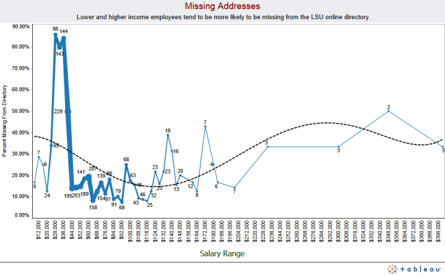
Missing LSU Employee Addresses

Image

I love when a data project yields side information. In this case, while searching the LSU directory for employee contact information, I found that lower-salary employees were *much* more likely to be missing from the LSU online directory. Numbers are fun.

http://public.tableausoftware.com/views/manualmap2test/MissingAddressSimpleDash?:embed=y&:display_count=no