Hispanic America is a Mexican America

Hispanic_AmericaToday we look past the general term Hispanic to see where America’s Hispanics truly come from. Calling someone “Hispanic” is like calling them “European.” It speaks somewhat to their ancestral heritage, but encompasses a *very* broad swath of very different folks.

Yet as we see when we map the United States by most populous Hispanic sub-type for each zip code, we find the Hispanic population of America is, overwhelmingly, Mexican.

To arrive at this took a very tedious formula. I’m sure there’s some better way to do it, but the only way I knew was with an IF, AND, THEN, ELSE statement. Basically, for each sub-type, I made a formula that said, “If there are more of this group than that group, and that group, and that group, and that group (etc.) then this group is the biggest group in the zip code.” If the group wasn’t the largest, the code looked at the next one. And so forth, and so on. Here is the code for just one of the ethnic groups I looked at:

if [Guatemalan]>[- Cuban] and [Guatemalan]>[- Dominican (Dominican Republic)] and [Guatemalan]>[- Mexican] and [Guatemalan]>[- Other Hispanic or Latino: – Spaniard] and [Guatemalan]>[- Other Hispanic or Latino: – Spanish] and [Guatemalan]>[- Other Hispanic or Latino: – Spanish American] and [Guatemalan]>[- Puerto Rican] and [Guatemalan]>[Argentinean] and [Guatemalan]>[Bolivian] and [Guatemalan]>[Chilean] and [Guatemalan]>[Colombian] and [Guatemalan]>[Costa Rican] and [Guatemalan]>[Ecuadorian] and [Guatemalan]>[Honduran] and [Guatemalan]>[Nicaraguan] and [Guatemalan]>[Other Central American] and [Guatemalan]>[Other South American] and [Guatemalan]>[Panamanian] and [Guatemalan]>[Paraguayan] and [Guatemalan]>[Peruvian] and [Guatemalan]>[Salvadoran] and [Guatemalan]>[Uruguayan] and [Guatemalan]>[Venezuelan] then “Guatemalan”

Here’s a link to the Tableau tool: https://public.tableausoftware.com/profile/jared5561#!/vizhome/themexicans/HispanicAmerica

Advertisement

Technicolor Hyper-kinetic Campaign Finance Explosion!

second-sen-gif

The Louisiana Senate race draws on money from across the nation. The animation above is looking at individual donations – donations that can be tied directly to a particular human (rather than some committee) and shows how, over time, both Landrieu and Cassidy have seen their in-state share of donations shrink. Cassidy ends up with 58% of his donations coming from Louisiana, but if we look at breakdowns by quarter, we find that in the most recent quarter, Cassidy received more out-of-state dollars (as a percent of his total) than Landrieu did.

Click on any graphic to get it full-screen — they look *much* better that way.

Percent from Louisiana Line Chart

Before you become completely offended by so much outside money flowing into Louisiana, it’s important to have a benchmark. Hence, we take a look at Kentucky, where *both* Senate candidates are running at roughly 20% in-state donor levels. Let me know which design you prefer, by the way – I like the Louisiana animation better. It’s more recent, and I think I improved it with time. I’d like to know what everyone else thinks.kengif2


An overall comparison of district 6 congressional candidates — this is pure horse-race coverage stuff, trying to show lead changes in fundraising over time:

new-all-8-house-members-animated-gif

Now, let’s kick up the epilepsy-inducing intensity! Here are animations of District 6 house race candidates, and their in-state percentages of donations over time:

edwin-edwards-animated-gif-FIXED       new-animated-gif-graves

new-animated-gif-felder   new-animated-gif-trey-thomas

new animated gif claitor

new-animated-gif-mcculloch

new-animated-gif-dietzel

new-animated-gif-whitney

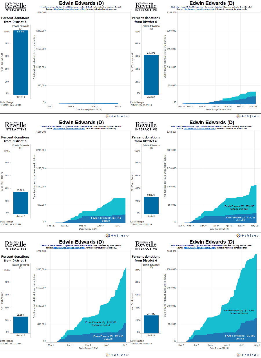
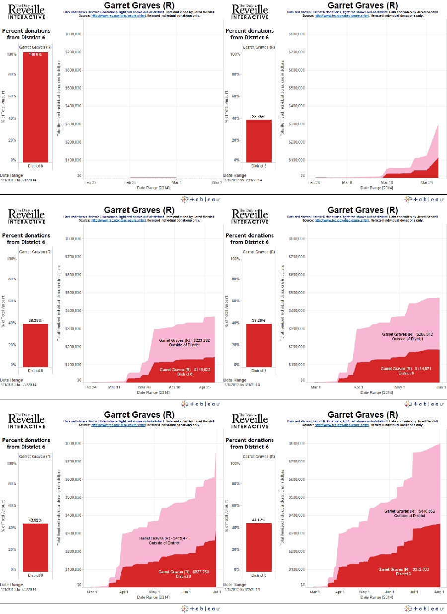
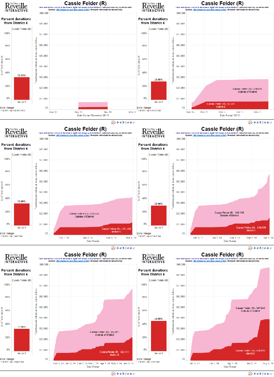
And, finally, we look at the same candidates, only *this* time we examine their in-district versus out-of-district fundraising. Be sure and check out Edwin Edwards and how he changes once you look at district rather than state.

district-animated-gif---charles-thomas  district-animated-gif---edwin-edwards

district-animated-gif-mccullochdistrict-animated-gif---gravesdistrict-animated-gif---claitordistrict-animated-gif---whitneydistrict-animated-gif---dietzeldistrict-animated-gif---cassie-felder

The Monarchist of LSU

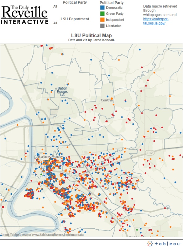
One hears about liberal bias in education on a regular basis – but is it true? Just how liberal *is* LSU?

ImageNot very, as it turns out.

After running every name from the Reveille’s database of faculty and staff to retrieve their political party affiliations, I found that the LSU faculty is actually about 10 percentage points less Democrat-leaning than the surrounding Parish. The data says that LSU is no hotbed of liberalism – and it also showed we had a Monarchist. That one came as a surprise.

Working with Fernanda Zamudio-Suarez, my favorite reporter at the Reveille, we put together a great package showcasing the results and the implications of those results. Fern even knew the Monarchist – Faculty Senate President Kevin Cope – and got him to open up about his party affiliation.

http://www.lsureveille.com/news/politics/faculty-senate-president-opens-up-about-political-affiliation/article_216dc6b8-ad73-11e3-ad3d-001a4bcf6878.html

The data was a blast, and it showed all sorts of fascinating things. The most liberal department on campus, unsurprisingly, was Music & Dramatic Arts, where 71.79 percent of the faculty & staff are registered Democrats (of those I was able to retrieve party affiliation for). The least liberal department, was UC Advising & Counseling, where 20 percent of the staff are Democrats, and 46.67 percent are Republicans.

Image

To me, this is the perfect example of how data journalism should be done. We took a dataset we owned – the salary database for the university – and leveraged it into a brand new story, and a brand new insight, simply by running it through a new source of information. Data is all about recombinant information – the mutational evolution of your understanding of the world.

Plus, we found a Monarchist. I don’t think that’s ever going to get old.

Now, I just need to find a new, fun data project to feed Fern – I’m sure she’s disappointed I haven’t kicked anything good her way in quite some time.

One final addendum – after publishing, a friend of a friend asked about what would happen if we had zeroed in on the faculty alone – rather than faculty & staff together. I can’t do that breakdown perfectly, but I can approach it, and when I do it shifts the numbers by a bit less than 3% toward Democrat affiliation. The new numbers, if I’m trying to just grab them for faculty without staff, run 40.77% Democrat, 25.47% Republican, and 33.03% Independent. Don’t let the apparent precision of those percentages fool you — they’re my best attempt at faculty isolation, but they’re not perfect. Even these isolated numbers, however, fail to achieve a strong liberal bias. If you want strong bias, your best bet remains looking at different departments. Music & Dramatic arts, I’m looking at  you.

Special thanks to professor Rosanne Scholl for pointing out that whatever my personal feelings on the matter, the major political parties remain proper nouns and deserving of capitalization. Thanks as well go out to Barbara Clark, who asked the question I failed to consider: How do the numbers change if you look at faculty separate from staff?

The Electoral Boogieman: Voter Suppression Dirty Tricks

Lexis/nexis search results for "voter suppression", graphed over time.

Lexis/nexis search results for “voter suppression”, graphed over time.

I set out to look into voter suppression in terms of political communication, and ended up finding something a bit odd — while systematic disenfranchisement is very real, the kind of “I can’t believe they did that!” suppression we hear about in the news appears to be largely a made-up problem. Something which a handful of amateur would-be election riggers engage in, and which professional communicators then seize upon as a resource for fundraising and partisan mobilization.

My storify: http://storify.com/jwkendall/keeping-out-the-vote

How do we know? A simple Google search. When you hunt for “voter suppression” and, say, “flyers”, you get a handful of results, and most of what you find is a lot like the three examples shown here: http://www.solarbus.org/stealyourelection/voter-suppression-flyers.html

Quite honestly, those all seem like the sorts of things some bored, pissed-off crackpot would come up with on a Sunday afternoon. What’s more, I suspect their largest impact on elections comes not through vote suppression, but through the indignation such efforts inspire. Anger is a valuable commodity in the polarized political world.

The Female Edge

The Female Edge

Republicans beware: The women are coming.

Turnout advantage/disadvantage for women since 1964. Red color shows an edge for women, blue an edge for men.

Turnout advantage/disadvantage for women since 1964. Red color shows an edge for women, blue an edge for men.

Given that women vote overwhelmingly democrat, trends in turnout among the genders have serious implications for the  balance of power between the parties.

Data analysis shows that women have gone from a 4 point turnout deficit in the 1964 presidential election to a 4 point advantage in 2012. This advantage shift is even more dramatic if you look at it as a relative difference between the genders — in that case, women started with a 6.82% deficit and now enjoy a 7.54% advantage — roughly a 14 point swing.

To quantify this advantage, a “female edge” figure has been computed. To do so, the turnout rate for women for each election is taken and divided by the turnout rate for men. This gives a relative difference between the genders, rather than what would be arrived at if one simply subtracted the male turnout percentage from the female turnout percentage.

Over time, a clear and distinct trend is visible, showing that women are now going to the polls at a higher rate for men, and that this trend is on a very consistent upward climb. As the years pass, women are coming to dominate turnout figures.

Pundits often discuss the threat posed to the Republican party by increasing numbers of Hispanic voters. This may be a very real danger, but it isn’t the only one the Republicans face. If they continue to lag heavily behind the Democratic party in popularity with women, the female edge means Republicans face an ever-more-difficult path to electoral victory, particularly in national elections.

Using the tool, more information can be examined. For instance, these trends become markedly worse if you break things down by age. The only group where men have a higher turnout rate than women is in the 65-and-over crowd. Given that this group is aging, and dying, and given that the female edge is even greater among the other age brackets, it’s difficult to view these numbers as anything other than great news for Democrats, and a looming danger for the GOP.