
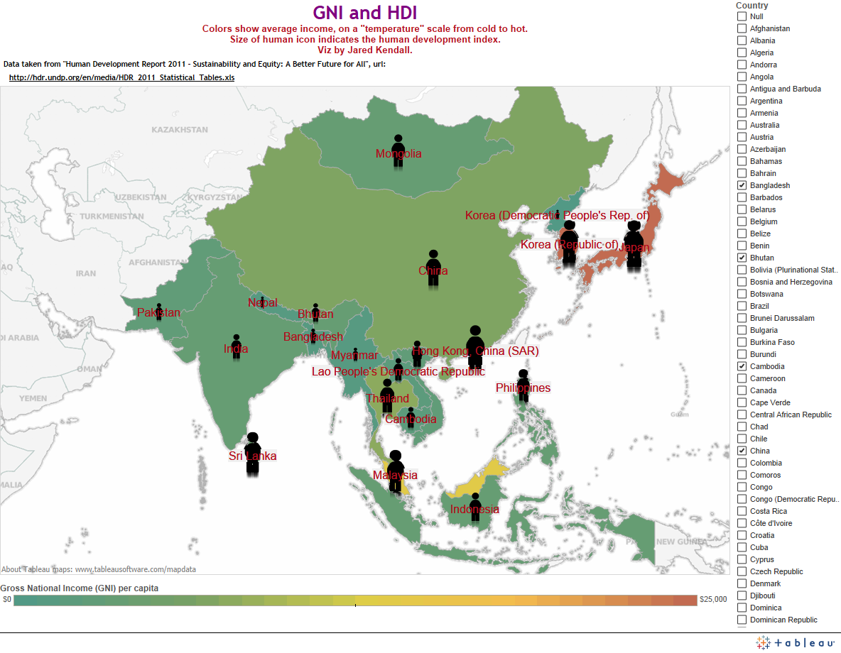
 I created several visualizations of gross national income (relative affluence of nations), shown by a “temperature” color scheme which runs from a cold aquamarine up to a hot brick red.
http://public.tableausoftware.com/views/GNIandHDI/GEOG1003?:embed=y&:display_count=no#1
The visualization also covers human development index, with human silhouettes. The size of the sillhouette indicates relative HDI for each country.
And, here’s a link to a global version of the map:
http://public.tableausoftware.com/views/GNIandHDI/GlobalGNIHDIMap?:embed=y&:display_count=no
I’m sure similar visualizations have been done before, but I believe this is a very effective way to present this particular data.
Enjoy!
