Technicolor Hyper-kinetic Campaign Finance Explosion!

second-sen-gif

The Louisiana Senate race draws on money from across the nation. The animation above is looking at individual donations – donations that can be tied directly to a particular human (rather than some committee) and shows how, over time, both Landrieu and Cassidy have seen their in-state share of donations shrink. Cassidy ends up with 58% of his donations coming from Louisiana, but if we look at breakdowns by quarter, we find that in the most recent quarter, Cassidy received more out-of-state dollars (as a percent of his total) than Landrieu did.

Click on any graphic to get it full-screen — they look *much* better that way.

Percent from Louisiana Line Chart

Before you become completely offended by so much outside money flowing into Louisiana, it’s important to have a benchmark. Hence, we take a look at Kentucky, where *both* Senate candidates are running at roughly 20% in-state donor levels. Let me know which design you prefer, by the way – I like the Louisiana animation better. It’s more recent, and I think I improved it with time. I’d like to know what everyone else thinks.kengif2


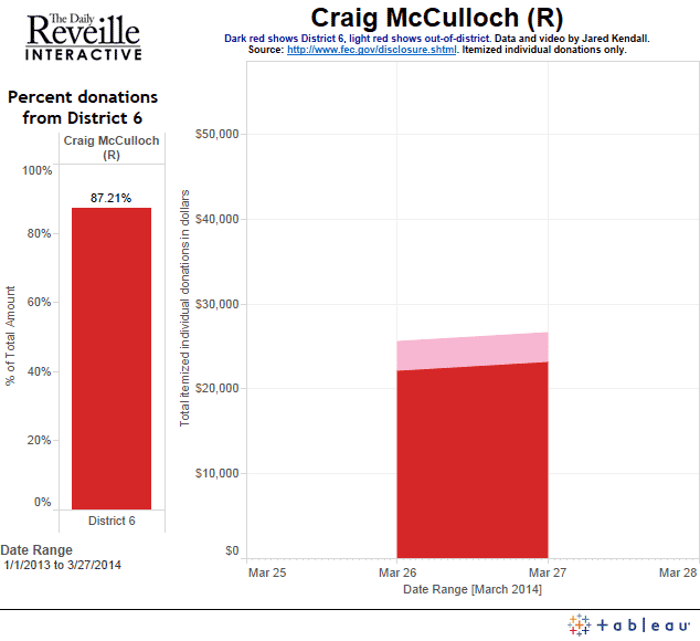
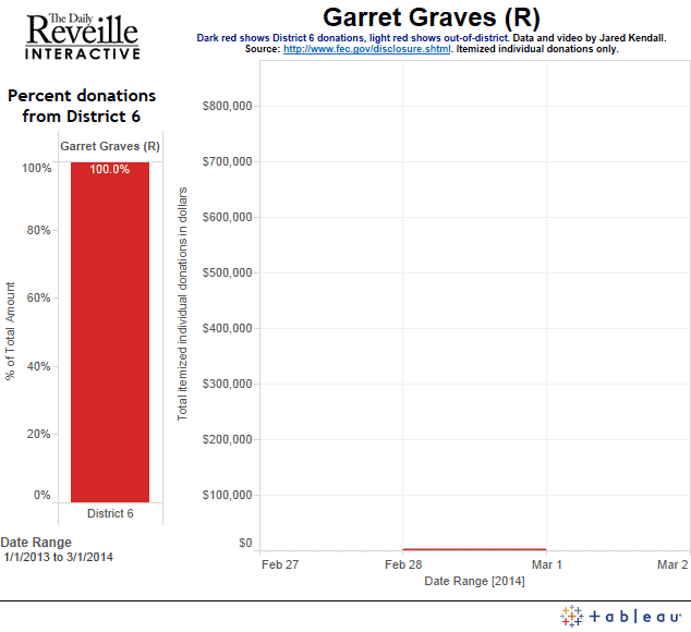
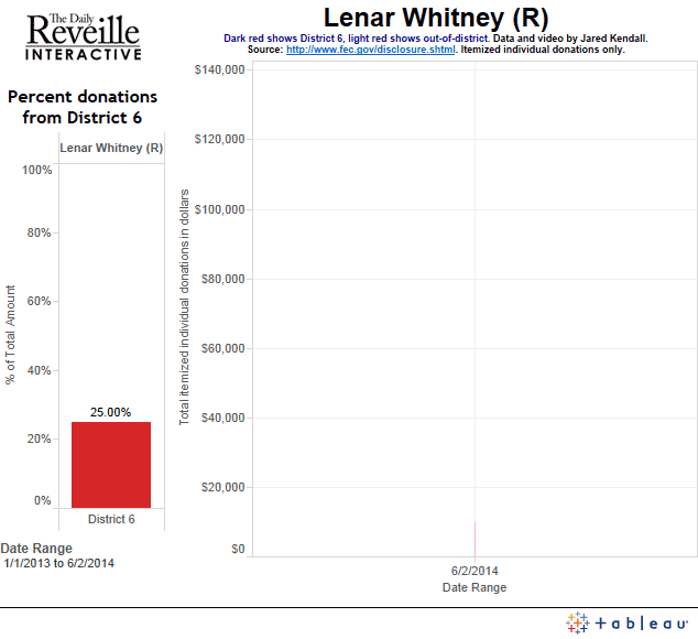
An overall comparison of district 6 congressional candidates — this is pure horse-race coverage stuff, trying to show lead changes in fundraising over time:

new-all-8-house-members-animated-gif

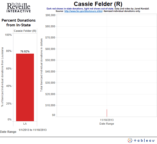
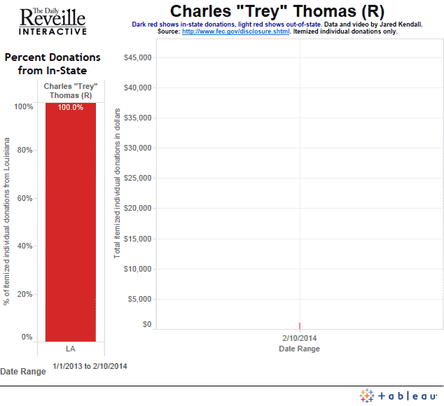
Now, let’s kick up the epilepsy-inducing intensity! Here are animations of District 6 house race candidates, and their in-state percentages of donations over time:

edwin-edwards-animated-gif-FIXED       new-animated-gif-graves

new-animated-gif-felder   new-animated-gif-trey-thomas

new animated gif claitor

new-animated-gif-mcculloch

new-animated-gif-dietzel

new-animated-gif-whitney

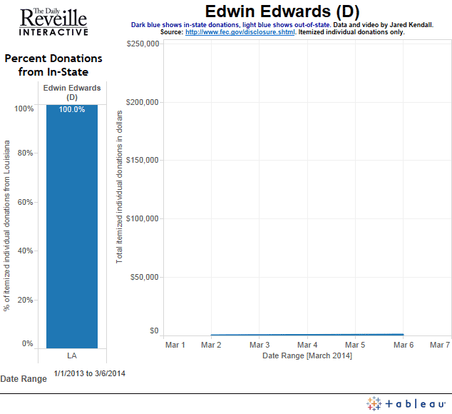
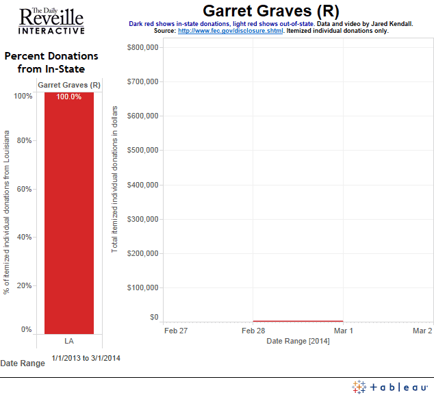
And, finally, we look at the same candidates, only *this* time we examine their in-district versus out-of-district fundraising. Be sure and check out Edwin Edwards and how he changes once you look at district rather than state.

district-animated-gif---charles-thomas  district-animated-gif---edwin-edwards

district-animated-gif-mccullochdistrict-animated-gif---gravesdistrict-animated-gif---claitordistrict-animated-gif---whitneydistrict-animated-gif---dietzeldistrict-animated-gif---cassie-felder

A Viz about Vizzes

I’ve committed to Tableau as my primary tool, and I’d like to think I’ve learned how to use it, but just how much progress have I objectively made?

I figured I’d use Tableau and find out.

Image

To me, the thing that jumps out is the audience lag. My “production mountain” shows all the work I’ve done, in terms of the cumulative number of worksheets and dashboards I’ve designed in Tableau over time. Cumulative views, on the other hand, shows how many views I’ve gotten based on the date I published various visualizations. I hit 100 total sheets in October of 2013, yet I didn’t hit my first chunk of views until late January, 2014 – approximately a 3 month delay. Apparently, I needed practice before I properly figured out how to publish tools worth eyeballs.

I also have a bubble map showing my most popular visualizations.This one is colored by time, using a heat map scheme – so the most recent visualizations will have a more brick-red color with older visualizations fading out toward blue.

I already mentioned my two area charts – Production Mountain and Cumulative Views Over Time. These are both running totals, one showing how many sheets I’ve designed in Tableau (individual sheets inside projects I’ve published), and the other showing how many views my visualizations have garnered.

The Monarchist of LSU

One hears about liberal bias in education on a regular basis – but is it true? Just how liberal *is* LSU?

ImageNot very, as it turns out.

After running every name from the Reveille’s database of faculty and staff to retrieve their political party affiliations, I found that the LSU faculty is actually about 10 percentage points less Democrat-leaning than the surrounding Parish. The data says that LSU is no hotbed of liberalism – and it also showed we had a Monarchist. That one came as a surprise.

Working with Fernanda Zamudio-Suarez, my favorite reporter at the Reveille, we put together a great package showcasing the results and the implications of those results. Fern even knew the Monarchist – Faculty Senate President Kevin Cope – and got him to open up about his party affiliation.

http://www.lsureveille.com/news/politics/faculty-senate-president-opens-up-about-political-affiliation/article_216dc6b8-ad73-11e3-ad3d-001a4bcf6878.html

The data was a blast, and it showed all sorts of fascinating things. The most liberal department on campus, unsurprisingly, was Music & Dramatic Arts, where 71.79 percent of the faculty & staff are registered Democrats (of those I was able to retrieve party affiliation for). The least liberal department, was UC Advising & Counseling, where 20 percent of the staff are Democrats, and 46.67 percent are Republicans.

Image

To me, this is the perfect example of how data journalism should be done. We took a dataset we owned – the salary database for the university – and leveraged it into a brand new story, and a brand new insight, simply by running it through a new source of information. Data is all about recombinant information – the mutational evolution of your understanding of the world.

Plus, we found a Monarchist. I don’t think that’s ever going to get old.

Now, I just need to find a new, fun data project to feed Fern – I’m sure she’s disappointed I haven’t kicked anything good her way in quite some time.

One final addendum – after publishing, a friend of a friend asked about what would happen if we had zeroed in on the faculty alone – rather than faculty & staff together. I can’t do that breakdown perfectly, but I can approach it, and when I do it shifts the numbers by a bit less than 3% toward Democrat affiliation. The new numbers, if I’m trying to just grab them for faculty without staff, run 40.77% Democrat, 25.47% Republican, and 33.03% Independent. Don’t let the apparent precision of those percentages fool you — they’re my best attempt at faculty isolation, but they’re not perfect. Even these isolated numbers, however, fail to achieve a strong liberal bias. If you want strong bias, your best bet remains looking at different departments. Music & Dramatic arts, I’m looking at  you.

Special thanks to professor Rosanne Scholl for pointing out that whatever my personal feelings on the matter, the major political parties remain proper nouns and deserving of capitalization. Thanks as well go out to Barbara Clark, who asked the question I failed to consider: How do the numbers change if you look at faculty separate from staff?

Seminoles Most Overhyped CFB Team since 2000

over- and underrated teams by decade

As college football wraps up with all its bowl-ey goodness, it seemed a good time to share my all-time overrated and underrated tool.

http://public.tableausoftware.com/views/overrated3/OverratedDash?:embed=y&:display_count=no

The tool shows that for the “decade” since 2000, Florida State has been dramatically overrated – at least by this measure.

Feel free to explore. Here are some tool options:

  • Click on any of the teams in the list to pull up their detailed results, and see *how* they got their score.
  • You can also click on the drop-down to see a team’s results.
  • Select a different decade – or look at the all-time results by choosing “all” decades.
  • Sensitivity helps choose how detailed the ranking list is. Adjust it to fit your tolerance for list crowding.

Turkeys Over the Years

turkeyAs we sit down to feast and avoid picking a fight with Uncle Pete, why not take a moment to reflect on all the great turkeys to go before? America hasn’t always eaten so much turkey, but after a mad dash to the top, the bird has apparently hit some sort of glass ceiling… Or glass coop, at least. Domestic consumption has leveled off, and only increases in exports appear to show much hope for turkey sales to really take flight.

http://public.tableausoftware.com/views/TurkeyFeast/ATurkeyFeast?:embed=y&:display_count=no

A_Turkey_Feast

California vs. The World

The Reveille put up our latest update on the Associated Press college football rankings ( http://bit.ly/1cFcYIq ), and beyond showing that one voter pegged the Tigers as the 20th-best team in the country on his ballot this week, I found some interesting results in the pollster sentiment maps for Stanford, Ohio State and Baylor. The sentiment map is simple — it averages the ballot ranks for pollsters in a given state, then compares the states to one another to see where pollsters live who love a team, and where the ones live who hate a team.

This week, the most interesting thing I found in the weekly sentiment maps is the impression they can give of a California championing Stanford against a nation more keen on Ohio State or Baylor.Image

After checking out Stanford and their west coast support, compare that to the map for Ohio State:

Image

Or you could look at Baylor, which is quite similar (at least at first glance) to the map of sentiment generated for Ohio State:

Now, sentiment maps like this aren’t proof of regional bias… But if regional bias *does* exist, we would certainly expect to see it in the map. More updates as the season continues!Image

The Female Edge

The Female Edge

Republicans beware: The women are coming.

Turnout advantage/disadvantage for women since 1964. Red color shows an edge for women, blue an edge for men.

Turnout advantage/disadvantage for women since 1964. Red color shows an edge for women, blue an edge for men.

Given that women vote overwhelmingly democrat, trends in turnout among the genders have serious implications for the  balance of power between the parties.

Data analysis shows that women have gone from a 4 point turnout deficit in the 1964 presidential election to a 4 point advantage in 2012. This advantage shift is even more dramatic if you look at it as a relative difference between the genders — in that case, women started with a 6.82% deficit and now enjoy a 7.54% advantage — roughly a 14 point swing.

To quantify this advantage, a “female edge” figure has been computed. To do so, the turnout rate for women for each election is taken and divided by the turnout rate for men. This gives a relative difference between the genders, rather than what would be arrived at if one simply subtracted the male turnout percentage from the female turnout percentage.

Over time, a clear and distinct trend is visible, showing that women are now going to the polls at a higher rate for men, and that this trend is on a very consistent upward climb. As the years pass, women are coming to dominate turnout figures.

Pundits often discuss the threat posed to the Republican party by increasing numbers of Hispanic voters. This may be a very real danger, but it isn’t the only one the Republicans face. If they continue to lag heavily behind the Democratic party in popularity with women, the female edge means Republicans face an ever-more-difficult path to electoral victory, particularly in national elections.

Using the tool, more information can be examined. For instance, these trends become markedly worse if you break things down by age. The only group where men have a higher turnout rate than women is in the 65-and-over crowd. Given that this group is aging, and dying, and given that the female edge is even greater among the other age brackets, it’s difficult to view these numbers as anything other than great news for Democrats, and a looming danger for the GOP.

College Football Ranking Sentiment Map

Knowing where your team ranks each week is only half the battle – the other half is knowing *why* they ranked the way they did.

Map of rankings AP pollsters assigned Missouri, broken down by where pollsters live

Map of rankings AP pollsters assigned Missouri, broken down by where pollsters live

My new tool for the Reveille shows rankings, who voted for each team, and even puts together a national sentiment map to show where the voters live who love your team, as well as where on the map you’re not getting any love at all.

Here’s a link to my tool: http://public.tableausoftware.com/views/ReveilleWeek9APRankings-Narrow_0/DetailedAPCFBPollResults#1

Here’s the story on the Reveille: http://www.lsureveille.com/sports/football/interactive-see-where-ap-voters-ranked-lsu/article_af139c7c-39e2-11e3-82b4-001a4bcf6878.html

Not sure why my earlier post went away, but WordPress seems to enjoy doing that to me. Here’s hoping this post stays intact, so everyone can enjoy, share, and explore.

Oh – and be on the watch for a similar tool come basketball season!

Poverty in Asia

GEOG1003I created several visualizations of gross national income (relative affluence of nations), shown by a “temperature” color scheme which runs from a cold aquamarine up to a hot brick red.

http://public.tableausoftware.com/views/GNIandHDI/GEOG1003?:embed=y&:display_count=no#1

The visualization also covers human development index, with human silhouettes. The size of the sillhouette indicates relative HDI for each country.


And, here’s a link to a global version of the map:


http://public.tableausoftware.com/views/GNIandHDI/GlobalGNIHDIMap?:embed=y&:display_count=no

I’m sure similar visualizations have been done before, but I believe this is a very effective way to present this particular data.


Enjoy!